By: Udita Singh
Politics is dirty stuff but dirtier is the task of marketing it. Political advertisements can create history or haunt parties for that ‘one bad ad’. The world has seen some great examples of political advertisements where words playfully roll with symbolic images.This is an area where people matter, not just money. Some of the most powerful ads were designed by ad-majors like Saatchi & Saatchi, JWT, and Ogilvy. Indian political parties, on the other hand, typically fall into the “bad” and “ugly” category when it comes to ads. And the reason can’t be money, we know that! Political ads in India are in some senses a reflection of the parties themselves, low on creativity high on worship.
We bring you the good, the bad, and the ugly from the political ad world.
The Good
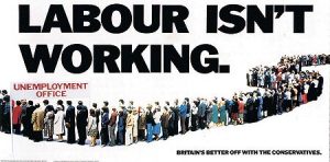
‘Labour isn’t working; Britain’s better off with the Conservatives.’
Voted the best poster advertisement of the century, it won the Tories the 1978 election and became a benchmark for political advertising the World over. A perfect example of a ‘clever’ poster. The same group of people were used repeatedly to form the long line one sees in the poster. Many thought this to be “deceitful”, but it did the trick.
Elections were delayed for a year, next year the Torries released another poster: ‘Labour still isn’t working’.
Lesson 1: Witty. Few strong words. Hard-hitting. Provocative. Advertisements like these challenge the opposition. Such ads are the battle grounds before the battle for ballots. This is what provokes thot – minus the ‘ugh’.
A unique party with an important message. The Green Party of Aotearoa (yes we got the name right) is a political party of New Zealand. Their primary focus is environment. Yes, a nice holiday from the usual head-butting between political leaders, clean and simple.
Lesson 2: Simple. A responsible message can be useful.
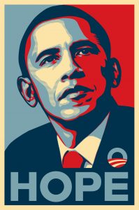
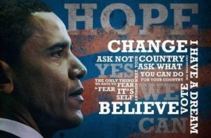
Lesson 3: Speaks volumes, radiates positive energy. Focus on action and task-oriented words. The campaign – developed in one day – was well planned and focused on two words: Hope and Change. It does not take time to make an effective political poster. All it takes is an idea or a thought, translated into impactful imagery. The test of its success is the lasting impression it created on the viewers mind. It became the most widely-circulated poster in Obama’s campaign. His expression denotes a determined man, chin up and questionably observant. A leader’s expressions are important, a smiling Sonia and her gang do not seem very reassuring.
THE BAD
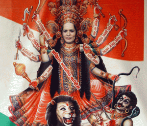
Wow! Sonia Gandhi as Goddess Durga in Congress posters. The reflex reaction to which, was a case filed against her for hurting the sentiments of Hindus.
Lesson 4: Unless selling idols of gods and goddesses, we request politicians not to uniquely ‘immortalize’ themselves. Politicians depicted as Gods are a big ‘NO’. Similar controversy was stirred by an ad with LK Advani as Brahma, Rajnath Singh as Lord Shiva and Atal Bihari Vajpayee as Lord Vishnu.
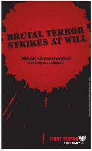
BJP! You get it all wrong!
So, Lesson 5? A violent, gruesome, patch of blood to denote terror. Opportunistic piece. Printed in early 2009, after terrorist attacks during the UPA govt. All governments fail at tackling terror, but what new would L.K Advani add to prevent such acts? Let’s talk substance, not aggressive politics.
Lesson 6: Lack of apt images. Dull. Boring. Call for action – none. Three painfully repetitive faces that dominate electronic news and print news. Fails to engage. Nothing to analyze or interpret.
THE UGLY
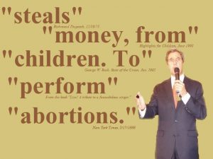
Bush Vs. Kerry, 2004. The ad was accused of taking words ”out of context” by highlighting controversial subjects. To the reader it appears as if he intended to speak in favor of the highlighted topics. Essentially Bush decided to go acid-dropping on Kerry.
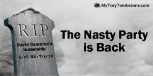
This Conservative Party poster backfired. Not happening.
Lesson 7: Misquoting.slandering. Back-firing of political ads. Welcome to the ugly side of politics.
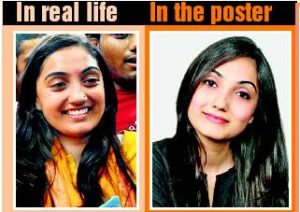
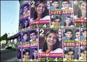
Errr…Everybody wants a good click. So, DU Students Union representatives are known to select their photos, after much re-takes…and clearly, much Photoshop (typically some whitening)!
Akhil Bharatiya Vidyarthi Parishad (ABVP) is a DU Students Union party backed by the BJP. In a typical ABVP-NSUI poster, the fair & lovely pretty face take up much of the canvas. Lots of posters dawn the campus walls each year. Heights of self-obsession! As uncreative and ugly as mass-produce of posters could get. By the end of the polls, the friendly-neighborhood bhelpuri-seller uses them to sell his sumptuous bhel while scores of posters carpet the roads.
Lesson 8: Save paper. Save trees. Go online. Political advertising includes social media. Why such massive waste of paper, when YouTwitFace is absolutely gratis.
Post Disclaimer
The opinions expressed in this essay are those of the authors. They do not purport to reflect the opinions or views of CCS.

